DESIGN @ KOTAK
Designing the autopay journey
of Kotak Cherry
ROLE
Product Designer
TEAM
2 Designers, 1 PM
DURATION
12 weeks
TOOLs
Adobe XD, Miro, JIRA
CONTEXT
Kotak Cherry is a digital platform by Kotak Bank that offers a variety of financial products, including mutual funds, stocks, bonds, and deposits. Mutual funds were the most popular product, with over 2 million users investing in them regularly. This was largely due to the convenience of SIPs, which allowed users to automate their monthly investments effortlessly.
What is SIP?
SIPs allow users to invest a fixed amount of money monthly into their chosen mutual funds. This approach helps users invest consistently without having to manually do it each time.
What is Autopay?
To make SIPs even easier, Kotak Cherry offers an Autopay System, which automatically debits the user's linked bank account and invests the amount into their mutual fund on a set schedule.
HOW DOES IT WORK?
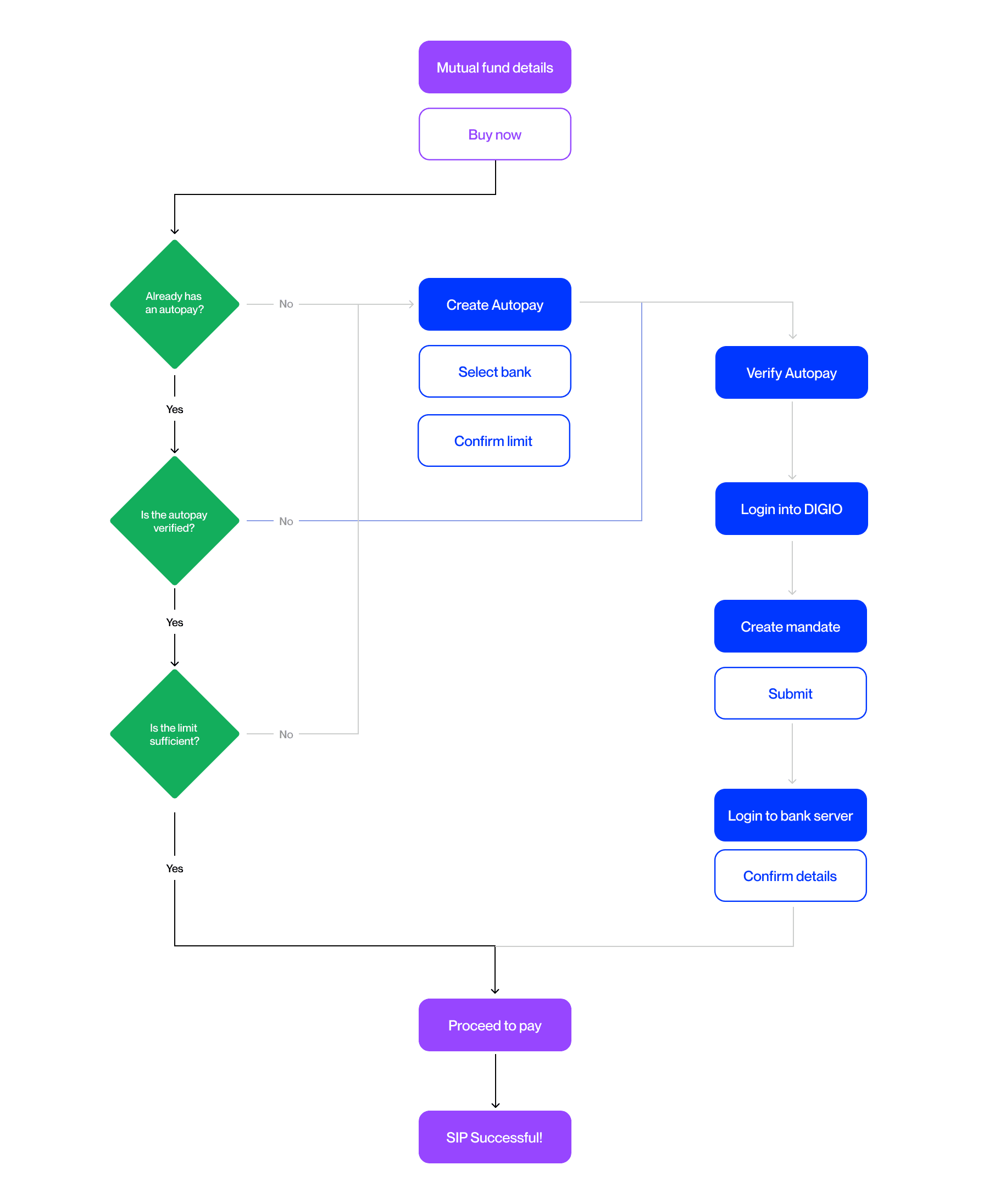
Once users selected a fund for SIP, they had to complete several mandatory steps, including setting up Autopay, which was essential for future investments. Kotak Cherry required users to verify Autopay before proceeding to payment. This process involved multiple third-party pages and wait periods for certain steps.
DATA INSIGHTS
Here's what we noticed:
Out of 100 users who landed on the "Create Autopay" page, only 25 proceeded, resulting in a 75% drop-off rate.
Around 60% of users would create Autopay but leave the verification pending. After 10 days, the setup would expire, forcing them to restart the process.
Users selected a different bank for payment than the one chosen during Autopay setup, resulting in failed SIP transactions.
DESIGN QUESTION
How might we reimagine Autopay to boost user engagement and deliver the hassle-free experience it was designed for?
ERROR AREAS
Through our research, we gathered insights that highlight key pain points in the Autopay setup process for SIPs. Here’s a summary of what our users expressed:
Missing Clarity
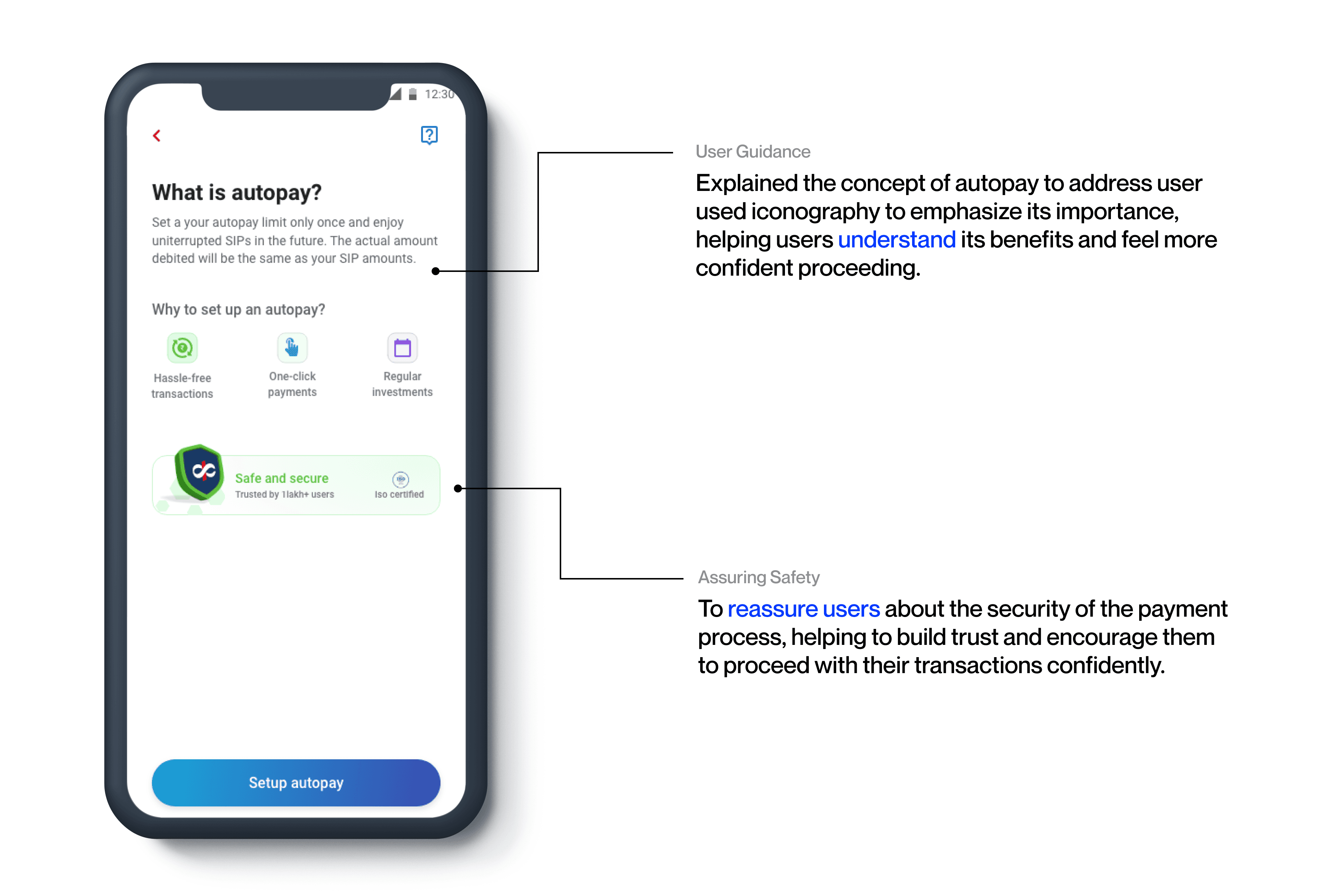
Users struggled to comprehend what Autopay is and how to use it effectively.
Users felt that the third-party software process was overly complicated, leading to frustration and confusion.
Information Gaps
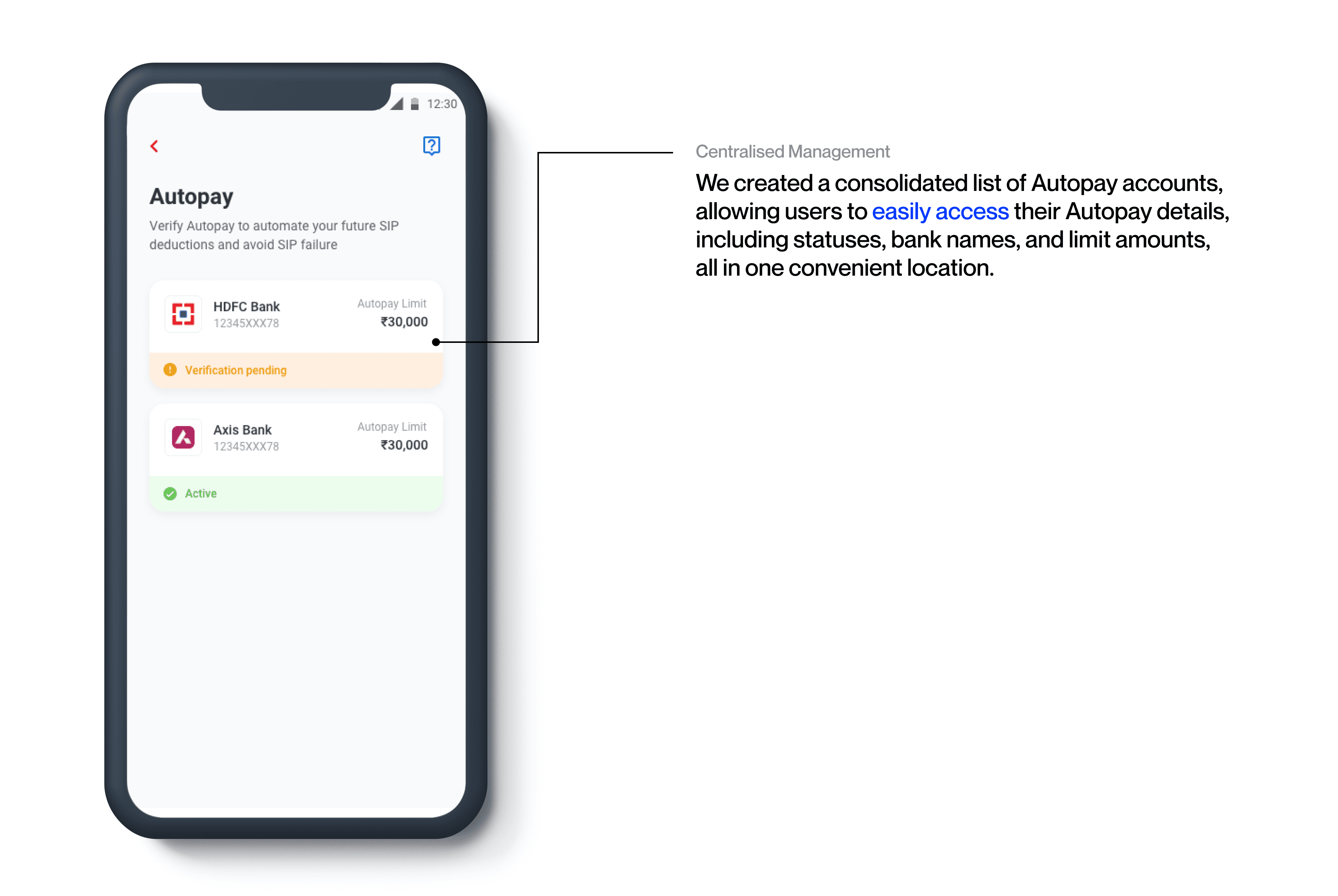
Users felt uninformed about which SIPs were linked to their Autopay.
Users were unaware that their payment bank needed to be registered with Cherry
Discoverability Issues
Users found it unclear when the buy journey would start if it didn’t follow immediately after clicking “Buy Now,” leading to confusion about the next steps.
Users often forgot how to verify their accounts and sometimes couldn’t easily locate the verification section when attempting to restart the process.
Users couldn’t find an option to add new banks, leading them to select whatever bank was already registered.
TECHNICAL LIMITATIONS
The Autopay process is constrained by certain technical limitations that impact user experience and functionality.
Mandatory Third-Party Integrations
The Autopay process relies on third-party integrations, such as Digio verification for identity authentication and Net banking for approval from your bank, which are essential and cannot be bypassed.
Bank Account Linking
Before linking their chosen SIP to Autopay, users are required to first register the bank account they wish to use. This step is essential for ensuring that the Autopay process functions smoothly and securely.
REDESIGN GOALS
Engagement and Transparency.
Increase user awareness through enhanced guidance and clear process explanations.
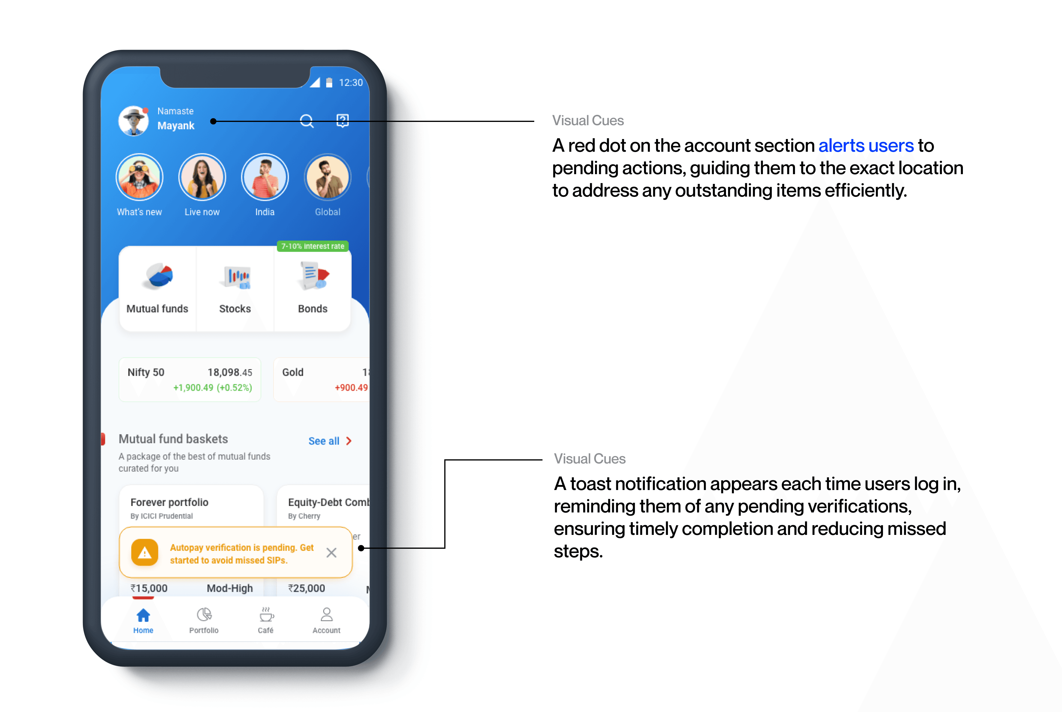
Streamline navigation with visual cues to help users verify autopay faster.
Improve navigational ease to support seamless access to key setup features.
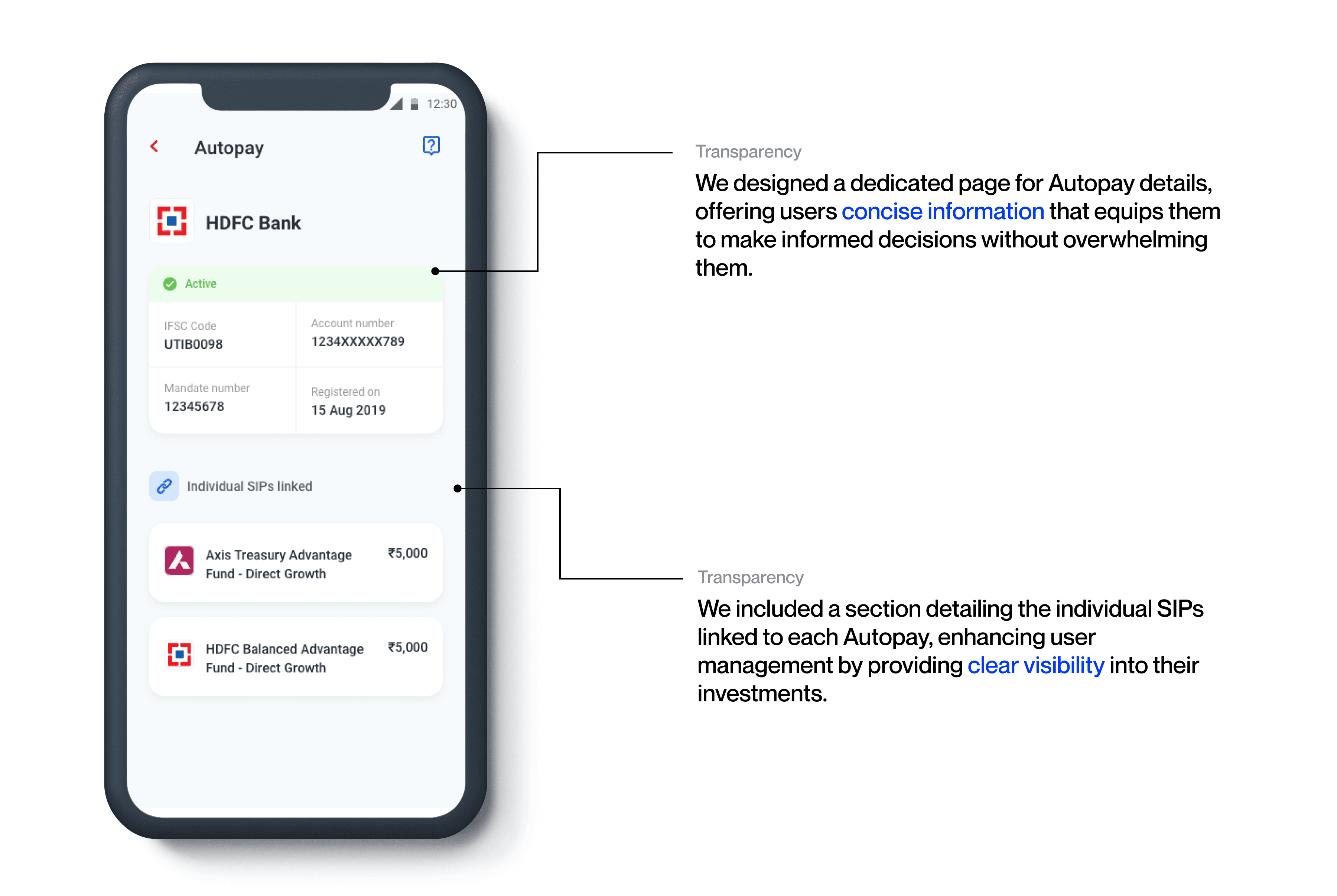
Ensure transparency in Autopay configurations by providing essential, contextual account details.
Enhance flexibility and control in bank management to meet diverse user needs.
REVISED USERFLOW
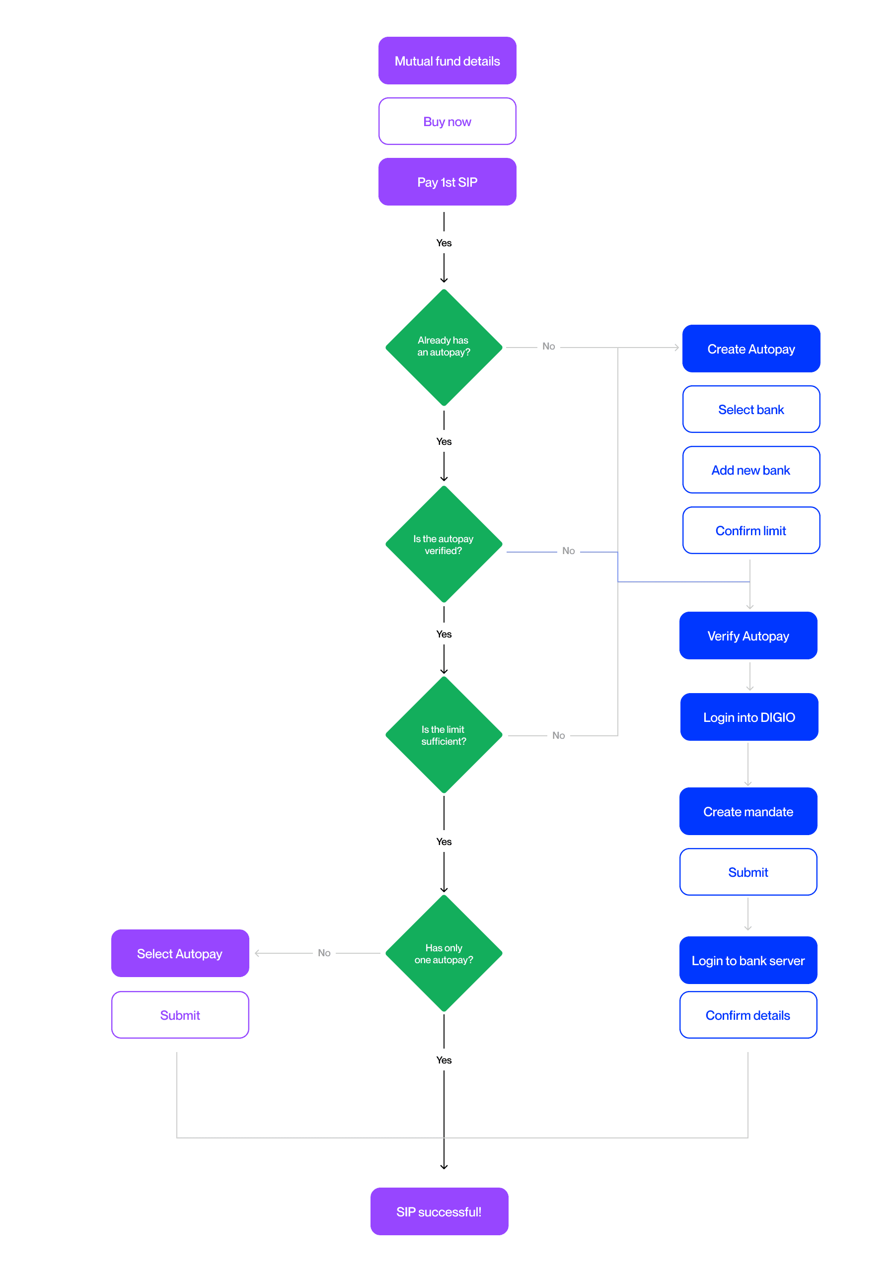
In the revised Autopay user flow, we allow users to make their first installment payment upfront, enabling them to start their investment journey right away.
FINAL DESIGNS
Keeping our design goals in mind and after a lot of iterations, we came up with the following designs.
BUSINESS OUTCOMES
The redesign simplified the user experience, resulting in measurable business improvements:
Number of SIPs initiated grew by 18% in a quarter.
Average transaction volume per user grew by 20%.
Users shared positive feedback with the customer success team, expressing how much simpler it felt to set up their autopay.
LEARNINGS
Perceiving is as important as interaction.
Understanding how users perceive and interact with your designs is essential, especially when they lack prior knowledge or context.
As designers, we have a responsibility to guide our users seamlessly through complex processes, making each interaction feel straightforward and accessible.