DESIGN @ UW
Redesigning Nightride :
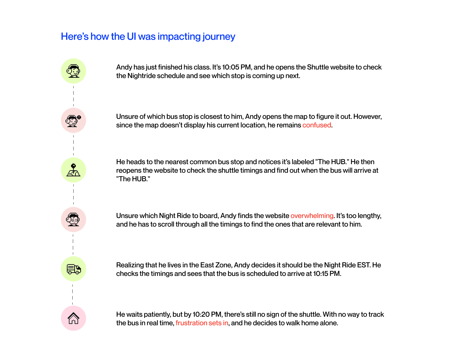
The Shuttle Service at UW
ROLE
Product Designer
TEAM
2 Designers, 2 PMs
DURATION
12 weeks
TOOLs
Figma, Miro, Notion
CONTEXT
Students at the University of Washington often have evening classes that can run as late as 10 PM. Many also stay late in campus libraries to complete their work. Given the size of the UW campus and the surrounding U-District area, navigating these spaces at night can feel unsafe, especially as buses become less frequent and commuting alone is less desirable.
In response, UW introduced Night Ride, a free shuttle service designed to safely transport students from campus buildings to their nearby residential streets. Despite the service’s convenience and comfort, a significant number of students still opt for regular buses or walk home alone.
This project aims to uncover the underlying reasons for this behavior and explore design solutions that could encourage more students to take advantage of the Night Ride service.
HOW DOES IT WORK?
The Night Ride service operates two shuttle routes covering different areas: Night Ride EST for the east zone and Night Ride WST for the west zone. Each shuttle serves specific scheduled stops within its designated zone, ensuring students can reach nearby residential areas safely.
To use Night Ride, students need to find the nearest shuttle stop, located conveniently throughout the UW campus. They can check shuttle arrival times online via the UW Shuttle website and wait at the stop until the Night Ride arrives.

UNDERSTANDING THE INITIAL PROBLEM SPACE
A post from UW’s subreddit featured a screen recording of a user navigating the UW Shuttle website, accompanied by questions about how to find shuttle stops and routes. This recording provided insights into potential usability challenges faced by students trying to use the Night Ride service.
DESIGN QUESTION
How can we help students locate shuttle stops and navigate the Night Ride service more efficiently on the UW Shuttle website?
USER PAINPOINTS
To better understand the challenges faced by students utilizing the Night Ride service, we conducted interviews with both UW students and Night Ride drivers. Our student participants included a mix of new users and those familiar with the service.
These discussions uncovered pain points that extend beyond usability issues, revealing deeper barriers in the service that impact accessibility, safety, and user confidence.
Navigation and Information Gaps
Users are unclear about which Night Ride shuttle corresponds to their specific destination.
Users struggle to identify the correct stop to board the shuttle from.
Users find it challenging to monitor the Night Ride shuttle’s estimated arrival time.
Users often wait without any indication of how long it will take for the shuttle to arrive.
Behavioural Issues
Many students prefer walking in groups at night and opt out of using Night Ride to avoid the hassle of coordinating a shared shuttle stop.
Night Ride drivers often travel between points with following a defined route. This lack of route structure increases delays for riders waiting at other stops.
THIS IS WHERE WE REALIZED,
The problem is deeper.
Our initial findings suggested low Night Ride usage due to app usability issues. However, discussions with drivers uncovered deeper operational challenges impacting the service’s functionality.
Drivers have to manually record each student’s destination on paper, making it difficult to plan an efficient route.
Remembering the order of stops and route sequence adds extra effort, leading to delays and occasional confusion.
COMPETITIVE "INSPO"
In addition, to gain insights into user preferences, we asked students, "What is your most used navigation app? Why do you like it?" Their responses highlighted key features that contribute to a positive navigation experience.
Google Maps
Overview
Google Maps is popular for its real-time location tracking, allowing users to see both their own location and live bus positions.
It also provides bus schedules, available timings, and delay notifications, making it a reliable tool for planning around public transit.
Widely used for discovering new places, which adds convenience for users exploring the area.
Limitations
Google Maps occasionally fails to adjust for special events or road closures, leading to inaccurate routes.
It may also display odd bus timings, sometimes suggesting later departures even when an earlier bus is available.
Direct Quote
" I like Google Maps because it is much better at searching things. Eg hotels, eating spots, petrol kiosks. The reviews, photos are also great."
Apple Maps
Benefits
Users appreciate the minimalist design, which makes it easier to follow directions, especially in urban areas with complex navigation needs.
It integrates smoothly with Apple devices and services, offering features like Siri voice commands and Apple watch.
Limitations
Despite improvements, some users report that Apple Maps occasionally provides incorrect or outdated information.
Compared to competitors, Apple Maps may lack certain advanced features, such as comprehensive public transit information.
Direct Quote
"I fell in love with Apple Maps when it started saying things like “after this light” cause it just makes everything so much easier for me"
OneBusAway
Benefits
Users say it's a great app for planning their commute, and that it's useful for knowing when to get on the bus.
Users often rely on OneBusAway alongside Google Maps because it helps optimize the timing of specific routes, making it useful for people who need immediate updates rather than static schedules.
Limitations
Users often experience missing buses altogether or buses that don’t arrive according to schedule, leading to frustration and uncertainty about arrival times.
Quotes
"I've found OneBusAway to be largely reliable when it's tracking buses. However, when it's based on a schedule, anywhere congested (like downtown) will have notable delays."
REFURBISHED DESIGN QUESTIONS
After uncovering new pain points from both users and drivers, we revisited our design questions. This allowed us to make them more specific and aligned with the deeper issues identified.
How might we provide students with real-time information on shuttle arrival times to minimize waiting uncertainty?
How might we streamline the driver’s route planning to reduce delays and improve efficiency?
How might we encourage group travel to enhance the safety and convenience of students using Night Ride?
QUICK EXPLORATIONS
Keeping our design goals in mind and after a lot of iterations, we came up with the following designs.
FINAL DESIGNS
Keeping our design goals in mind and after a lot of iterations, we came up with the following designs.
TESTING FEEDBACK
The redesign simplified the user experience, resulting in measurable business improvements:
Number of SIPs initiated grew by 18% in a quarter.
Average transaction volume per user grew by 20%.
Users shared positive feedback with the customer success team, expressing how much simpler it felt to set up their autopay.
LEARNINGS
Design is not Linear.
Understanding how users perceive and interact with your designs is essential, especially when they lack prior knowledge or context.
As designers, we have a responsibility to guide our users seamlessly through complex processes, making each interaction feel straightforward and accessible.